How effective is the combination of your main product and ancillary texts?
Connecting FeaturesBand Logo

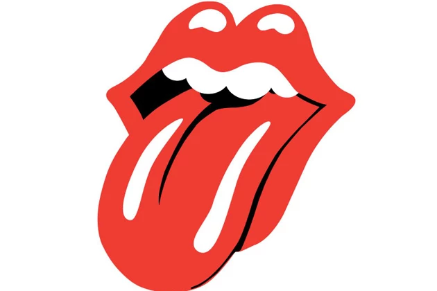
We created a band logo to act as a recognizable symbol, to mark our band's presence, it features in the digipak, website and is alluded to in the music video. Logo's are used by companies as symbols which are instantly recognizable to the general public, becoming synonymous with the brand. Musicians utilize these to a similar effect, often featuring on merchandise and promotional material to boost brand recognition. Logo's from the Rolling Stones and Nirvana have become so common place, they've gained fame far beyond the artists and their music. We followed this example by creating merchandise which included our logo.

Common Themes And Aesthetics
Throughout the products we attempted to adhere to set colour scheme; with pastoral blues, pinks, and greens in the digipak and website: this did not translate as strictly in the music video. While the clothing choices fit these parameters, with the blue blazer, most of the colours established in the other products didn't play a key visual role in the video.
The set theme of nature did, weaving all three products together, with many shots filmed outside in nature, and much of the art style revolving around the natural world. This was supported by the theme of death heard in the song's lyrics, and symbolized in the grave stone that is present in all three media forms.
Social Media Intergration

The logo found use in the promotional material to promote the band's web 2.0 presence and to build a social following. The same design is prominent in the profile to link it directly to the album's digipak and the website. Social media allows the band to communicate with fans and build a sense of community around the band, and by using social media to connect to other bands, to join the wider, interconnected landscape of the music genre.
Jeff Lynne

 Jeff Lynne did something very similar with his
 latest album Alone In The Universe. In all his products around the new release there was a strong connection of the graphics of his album cover such as the background to the home page on his website and the character featured in the graphic is the same as the one used in the music video of his lead single "When I Was A Boy". It sets up a theme between all of them and makes it clear to fans that they are part of the same product. This is something that we wanted to include in our products. His clothing is simple but formal and it carries over from the video to the website. Again as he is is signed to a major label, Sony Music, his products have the ability to look professional and be more large scale as his music is also featured on his label's website as well as his own. Overall it all creates a image for the label to sell as fans see these familiar gimmicks so that they can recognize such as the iconic ELO spaceship. The simplistic nature of the artists appearance and the more complex graphics and meaning behind his digipak and website are what inspired our work as he was closest to our genre and we wanted to create something slimier.
No comments:
Post a Comment